3 Pillars That Elevate Happy Paths
What a top-tier makeup app can teach us about creating winning customer experiences
Hey, it’s Alexandra. Welcome to my weekly newsletter where I share my latest reflections on professional development and well-being.
If you’re not a subscriber, here’s what you missed recently:
Subscribe to get future posts emailed to you:
This week, I share the power of creating customer experiences that are:
Personal
Empowering
Educational
☕️ Read time: 4 mins (best with tea or coffee)
In March, I was incredulous at the news my favourite makeup brand, bareMinerals, was no longer retailing in Canada.
A Sephora saleswoman gave me a sympathetic smile as she explained the brand’s iconic mineral foundation—my favourite makeup product of all time—was “old.” It had been around for over ten years so despite still being “great,” an array of new products had eclipsed it.
I felt cheated.
I’d only discovered bareMinerals a year ago and it was love at first use.
I credit my living in Paris from 2018 to 2020 as a wake-up call to the wisdom that good skincare is the best tool in your makeup kit. This foundation, composed of natural minerals and SPF 15, supported me in that aim. I’d never had so many people ask for my “secrets.”
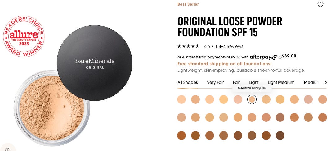
After I’d thanked the Sephora sales lady for confirming my nightmare, I stood amid one of Montreal’s most chaotic stores calmly contemplating how I could get my favourite foundation from the US.
Turns out I couldn’t.
At least not without involving someone based in the US who could purchase it locally and then ship it to Montreal. But that wasn’t a great long-term strategy.
I had to change products.
I was determined to find another natural one but unable to do so, I figured I might as well embrace the latest innovative alternative. That way I could minimize the chances of having another favourite foundation ripped from my makeup bag.
That’s when I discovered Charlotte Tilbury and the brilliant app they’ve built to elevate happy paths—in a fashion we can all learn from.
The Charlotte Tilbury App
Charlotte Tilbury has been around since 2013 but the UK beauty brand recently skyrocketed in popularity. In New York, celebrities modelled their award-winning makeup on the Met Gala red carpet in May.
Meanwhile, further north in Montreal, the brand claimed prime real estate by bagging the coveted entrance display at Sephora on Saint-Catherine Street.
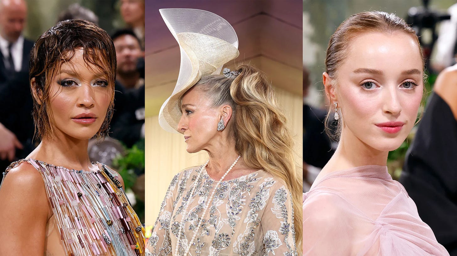
Upon exploring Tilbury territory (also known as their app), I noticed three “pillars” that elevate happy paths for their customers.
Three Pillars
1. Personalized experience
From the moment I selected my first interest (as you know, I was looking for the Holy Grail of foundations), I was guided through everything from how to choose:
A foundation based on my skin type. They recommend different options depending on whether your skin is oily, dry, normal, or a mix.
A shade based on my skin colour. There’s a “try it on” feature in which you use your mobile camera to see how the shade would appear on your face. I typically find this feature unreliable for most products (similar to how paint and nail polish can look different from samples once applied). But what I loved was another feature in which you can select your former foundation brand, product, and shade to determine what shade of Charlotte Tilbury is closest.
Complementary products. The best analogy a marketer has given me about constructing user-friendly apps and websites is to imagine people walking into a hotel. When they enter the lobby there’s clear signage directing them to their room and amenities like the bar, pool, or gym—and no matter where they go, there’s always signage guiding them wherever they plan to go next. Sometimes guests don’t even know where they feel like going next but thankfully, signage prompts them with options.
Each page within a site or app must have that same functionality in guiding people. You never want users hitting a dead end because unlike physically being in a hotel, they can exit an app or site at any time. The Charlotte Tilbury app gets this tenfold. Every time you click on one product it contextualizes how you can use it with other products which prompts you to keep exploring. All the while, you benefit from a personalized path through an otherwise overwhelming landscape.
2. Empowering language
“Before” and “after” pictures are the ultimate sales tactic since people are eager to pay for enhancements they can visualize. But what strikes me about the Charlotte Tilbury experience is how they go beyond the standard “before” and “after” captions with “beautiful before” and “beautiful after.”
As a user, it’s empowering to see body-positive language in both frames. It makes you feel good about yourself and your natural beauty and adds to the brand’s reputable radiance.
3. Educational content
The educational components of how to select, apply, and combine products are unmatched. From techniques on how to apply their foundations using specific brushes and strokes to applying their “magic” lotion using simple massage techniques that promote circulation, every product is contextualized with guidance to maximize self-care as part of your beauty routine and empower you through education.
Another key component of education is credibility. I know firsthand as someone who worked in corporate training in London from 2014 to 2016 that the UK is big on qualifications. So while I’d never thought of the beauty industry as adhering to said standards, I suppose I should have considered there are awards to be won on the makeup front. Charlotte Tilbury proudly promotes numerous “award-winning” products on their app and I certainly found those golden stamps eye-catching as I went about my search.
Key Takeaways
So there you have it, the three pillars of elevating happy paths. You have to design customer experiences that are personal, empowering, and educational. I hope these elements serve as helpful frames in designing customer experiences of your own.
On the one hand, I’m now a Charlotte Tilbury fan and grateful that being forced to switch foundations prompted me to discover the brand and its app—both have given me tons of inspiration for how to design top-tier products and customer journeys.
Plus their huge commercial success eleven years since their launch shows that great things take time. But when you’re passionate about what you’re doing, as Founder Charlotte Tilbury and her team are, you can make your dreams come true.
As the saying goes, “The time is going to pass anyway. So you may as well do what you want with it.”
Lastly, I will admit that despite now being a big Tilbury fan, I still prefer my bareMinerals foundation. So I will continue to contemplate enlisting American aid in shipping it North.
Thanks for reading and have a wonder-full week,
💛 Like or comment if you enjoyed this edition.
☕️ Reach out to grab coffee or tea in Montreal.


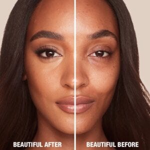
sometimes the smallest innovations show your audience that you're paying attention as a company and not running on autopilot. "beautiful before" and "beautiful after" is just a brilliant example of this.